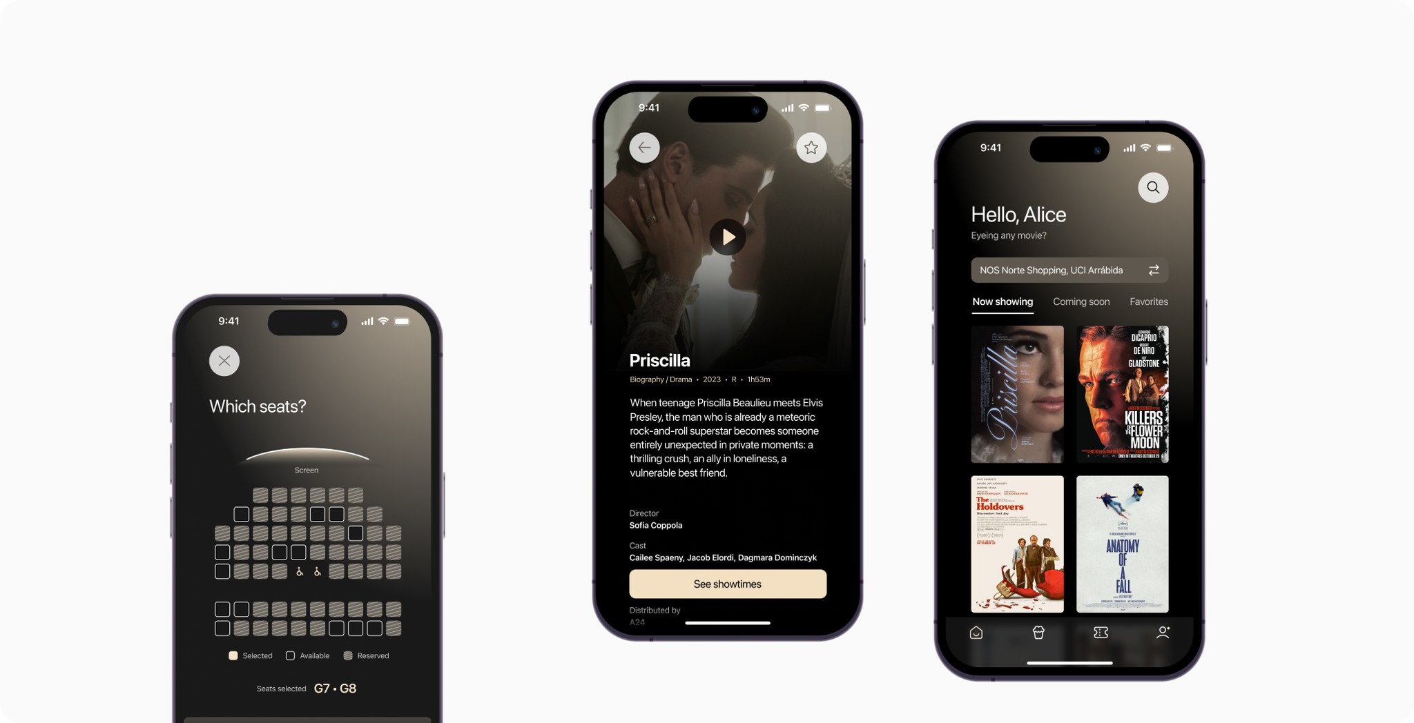
CineFusion, book a seat reservation without any hassle.

Role

Research, UX / UI

Duration

12 Weeks

Context

Solo project included in the Google UX Course

PROBLEM

Existing seat reservations apps have limited functionality with oftentimes cluttered interfaces and confusing navigation.

In today’s fast-paced world, movie-goers prioritize convenience, simplicity, and ease of use when booking seats. However, they often encounter multiple apps, each with challenges that negatively impact the overall user experience.

Given this context, how might we
improve the current process of purchasing movie tickets through an app?

THE SOLUTION

  • A complete experience

    Enjoy all available movie theaters and showtimes at your fingertips, in a single app.

  • Convenient for you

    Efficiently plan your movie plans and check the availability of each screening beforehand.

  • Flexible and easy

    Be prepared for the unexpected by managing your trip to the movies and tickets.

  • A complete experience

    Enjoy all available movie theaters and showtimes at your fingertips, in a single app.

  • Flexible and easy

    Be prepared for the unexpected by managing your trip to the movies and tickets.

  • Convenient for you

    Efficiently plan your movie plans and check the availability of each screening beforehand.

CONTEXT

Grounding the project first

This project was completed as part of the Google UX Design Course. The goal was to apply and practice the skills acquired during the course. The design challenge was to create a simple mobile app for a movie theater, based on a randomly generated prompt.

To create the suggested mobile app, I followed a process that allowed me to understand and apply the methodology. I grounded the project in a real-world problem/need, which involved identifying what problem the product would solve and why it was needed. To gain insight into these questions, I conducted primary research in the form of user interviews and a competitive audit. 


USER RESEARCH

My goals were to understand common user behaviors and to identify frustrations people experience during the process of purchasing a movie ticket through an app.

To achieve these goals, I asked research questions such as:

  • How often do you buy movie tickets through an app? And why?

  • What are the challenges you face in the ordering process? 

  • Is there any way in which you feel these challenges could be resolved?

KEY FINDINGS

Users either have a lack of freedoom or have to resort juggling multiple apps.

After gathering all the answers and searching for common themes, I understood that my interviewees were willing to see past the faulty experiences in favor of online purchasing.

As for the common themes

Lack of flexibility

Limited to non-existing ticket changing capabilities fail to accommodate users' schedules or unexpected changes.

Limiting experience

When choosing between a movie theater and a specific movie, showtimes can be crucial. Existing apps don't account for showtimes across different cinema chains, thus limiting user choices.

Complex interfaces

Cluttered screens leave users confused and frustrated trying to navigate the app and purchase tickets. 

COMPETITIVE ANALYSIS

Nothing on the market specifically addresses the limitations of existing apps.

Every Portuguese cinema chain provides its seat reservation application with limitations and inconsistencies, adding unnecessary complexity and diminishing the overall user experience.

Cinemas NOS

􀅼

Visually appealing and easy to use

􀅽

Lacks multiple language support and requires login for ticket purchasing

UCI Cinemas

􀅼

Free membership and rewards

􀅽

Confusing navigation

Cinema City

􀅽

Mandatory movie theater selection on the starting screen

􀅽

No digital ticket provided

Cinemas NOS

􀅼

Visually appealing and easy to use

􀅽

Lacks multiple language support and requires login for ticket purchasing

UCI Cinemas

􀅼

Free membership and rewards

􀅽

Confusing navigation

Cinema City

􀅽

Mandatory movie theater selection start screen

􀅽

No digital ticket provided

BRINGING THE SOLUTION TO LIFE

How would CineFusion compare?

A one-stop shop experience that would cater to every movie-goer's needs. The goal was to develop an app that would not only facilitate the seat reservation process but also provide a seamless and enjoyable experience from start to finish.

User-friendly

Minimize user frustration with an intuitive and simple interface.

Considerate

Provide efficient ticket management to adapt to the user’s needs.

Effortless

Simplify the user experience to avoid the need for using multiple apps.

USER PERSONA + USER JOURNEY MAP

Alice

Age: 36 years old 

Hometown: Lisbon, PT 

Family: Single, lives alone

Occupation: Lawyer

“I live a busy life so flexibility and efficiency are my allies”

􀁣 Goals and needs

Alice, a partner at a law firm, leads a busy life and often has limited free time due to her demanding work schedule. As a result, her ability to visit the cinema depends on her work, social life, and other commitments. She needs flexibility, efficiency, and variety to enjoy movies whenever her busy schedule permits, minimizing the stress of planning and booking movie outings.

􀀲 Frustrations

Alice, who already has a busy and unpredictable schedule, finds it difficult to book a movie outing. She wishes it was easier to find a convenient screening without having to go through multiple apps. Rescheduling is also stressful, which makes it hard for her to book a seat at all.

Discover Alice's User Journey Map →

Discover Alice's User Journey Map →

USER FLOW

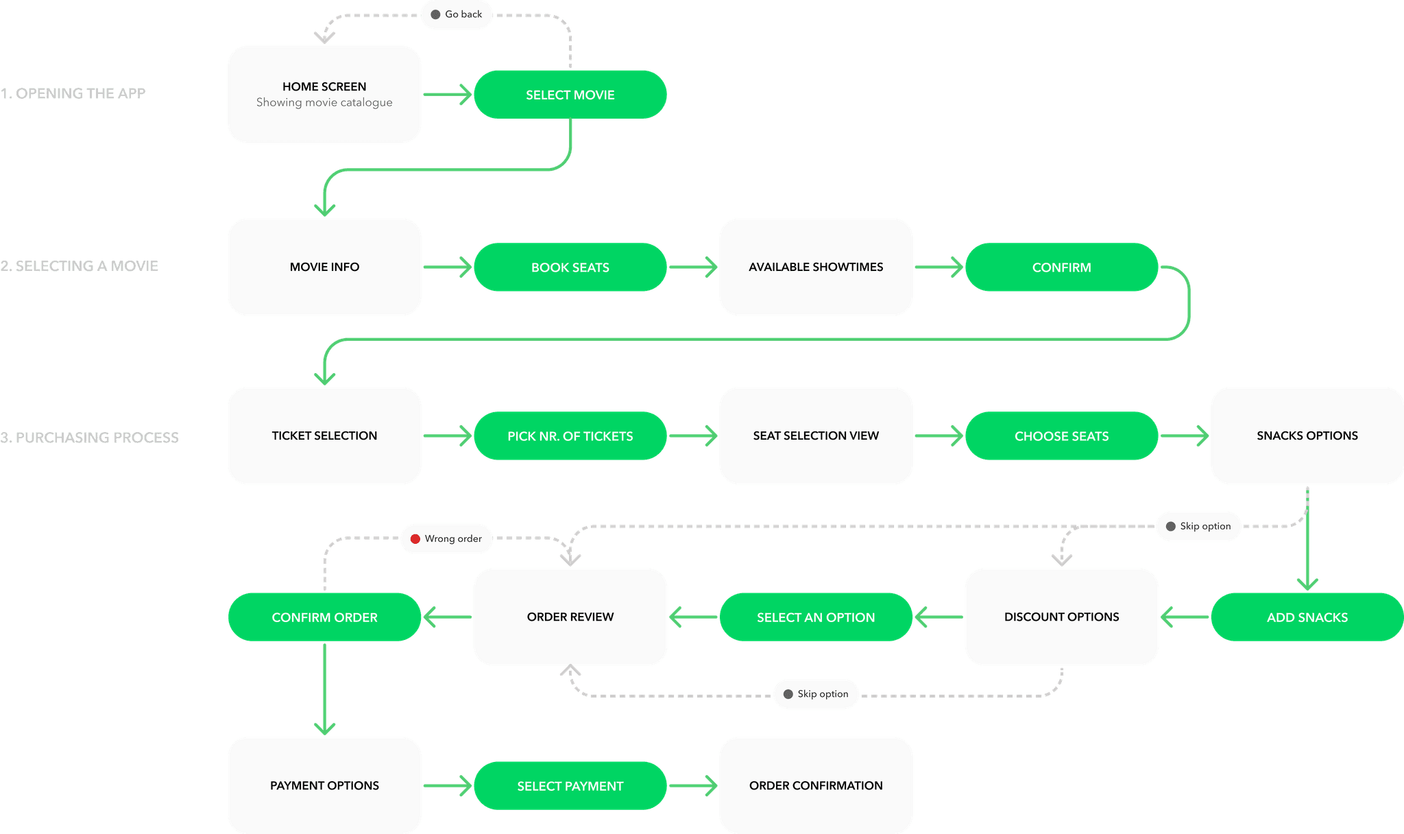
Buying a movie ticket, step by step

Imagining user flows helped me envision solutions and consider the user experience. By defining key scenarios, I could then start wireframing an app.

For instance, here is the user flow for purchasing a movie ticket. Initially, it consisted of five key actions, but it has since evolved into a more detailed diagram.

TESTING + IMPROVEMENT

Three design improvements

Upon constant testing and exploration of various flows towards the main app design, I continuously iterated on the solutions and it resulted in three major improvements.

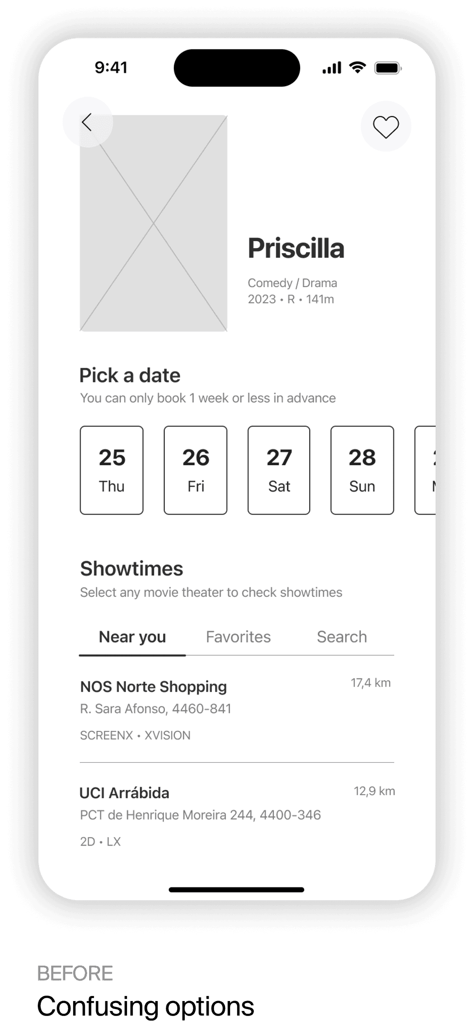
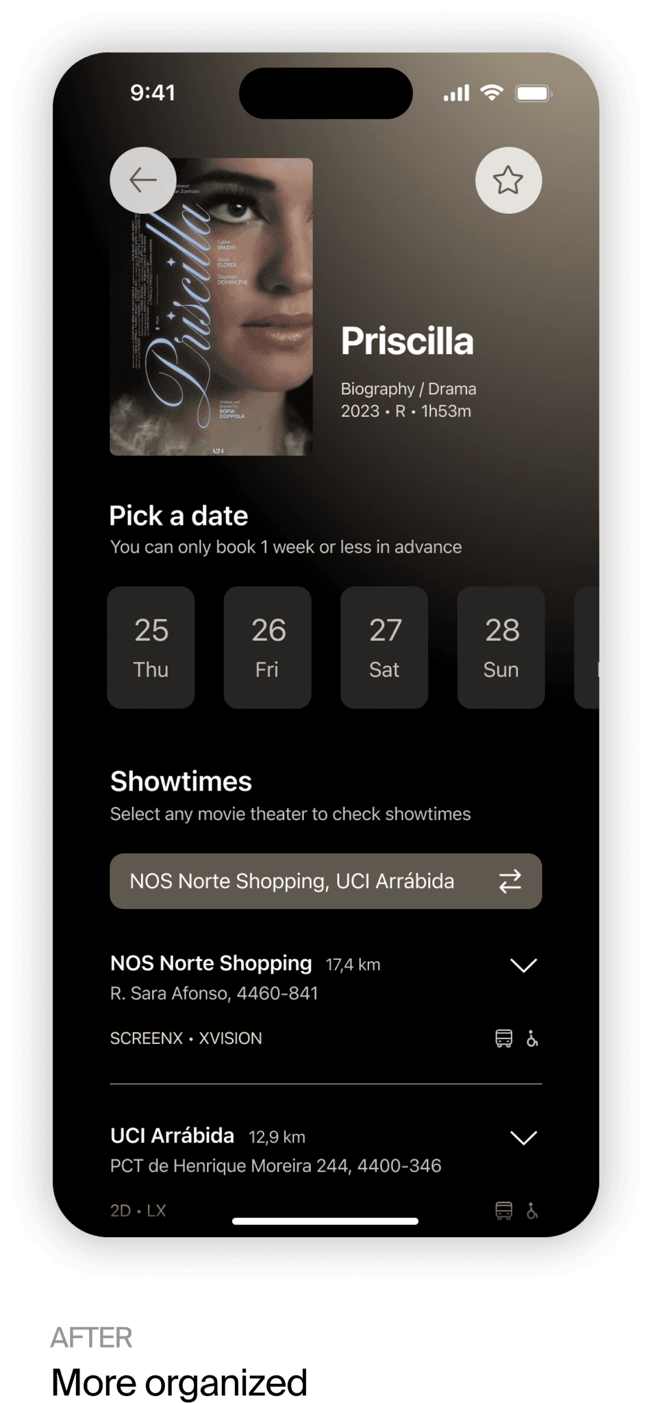
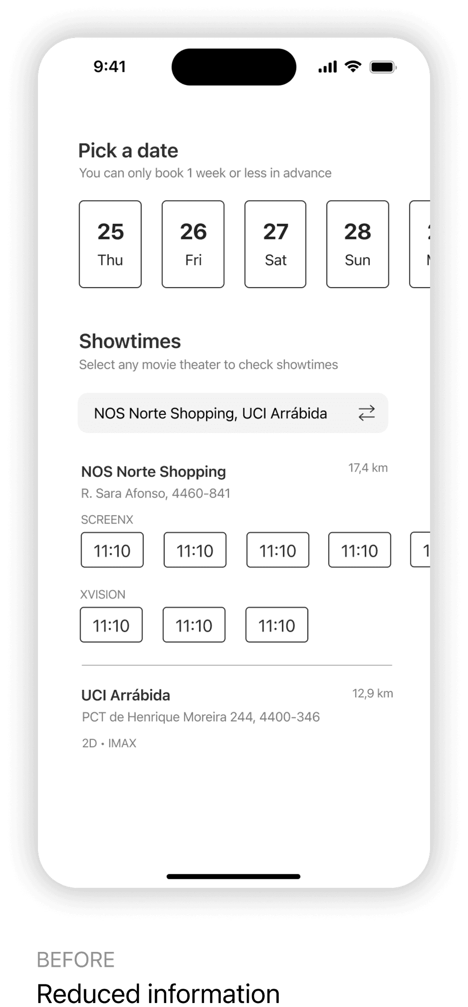
Movie theater selection

I initially designed the movie theater selection process to make choosing a movie showtime quicker and require fewer taps. However, this approach cluttered the screen and overwhelmed users with a lengthy, scrollable list of available cinemas.

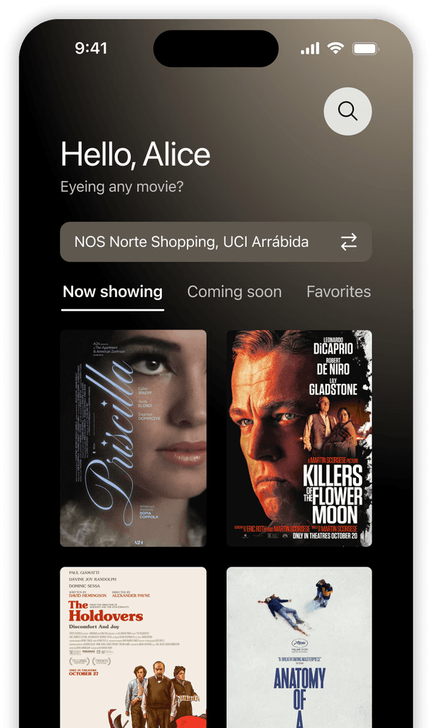
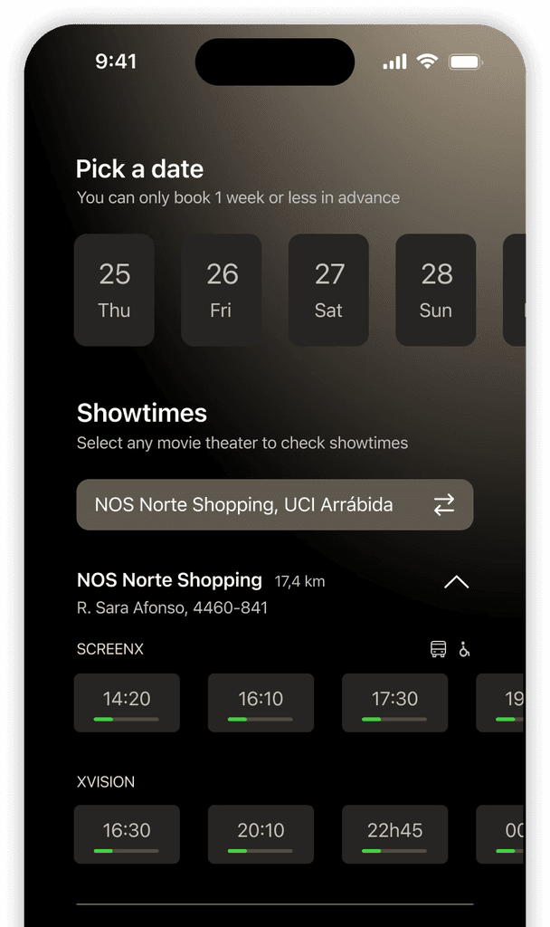
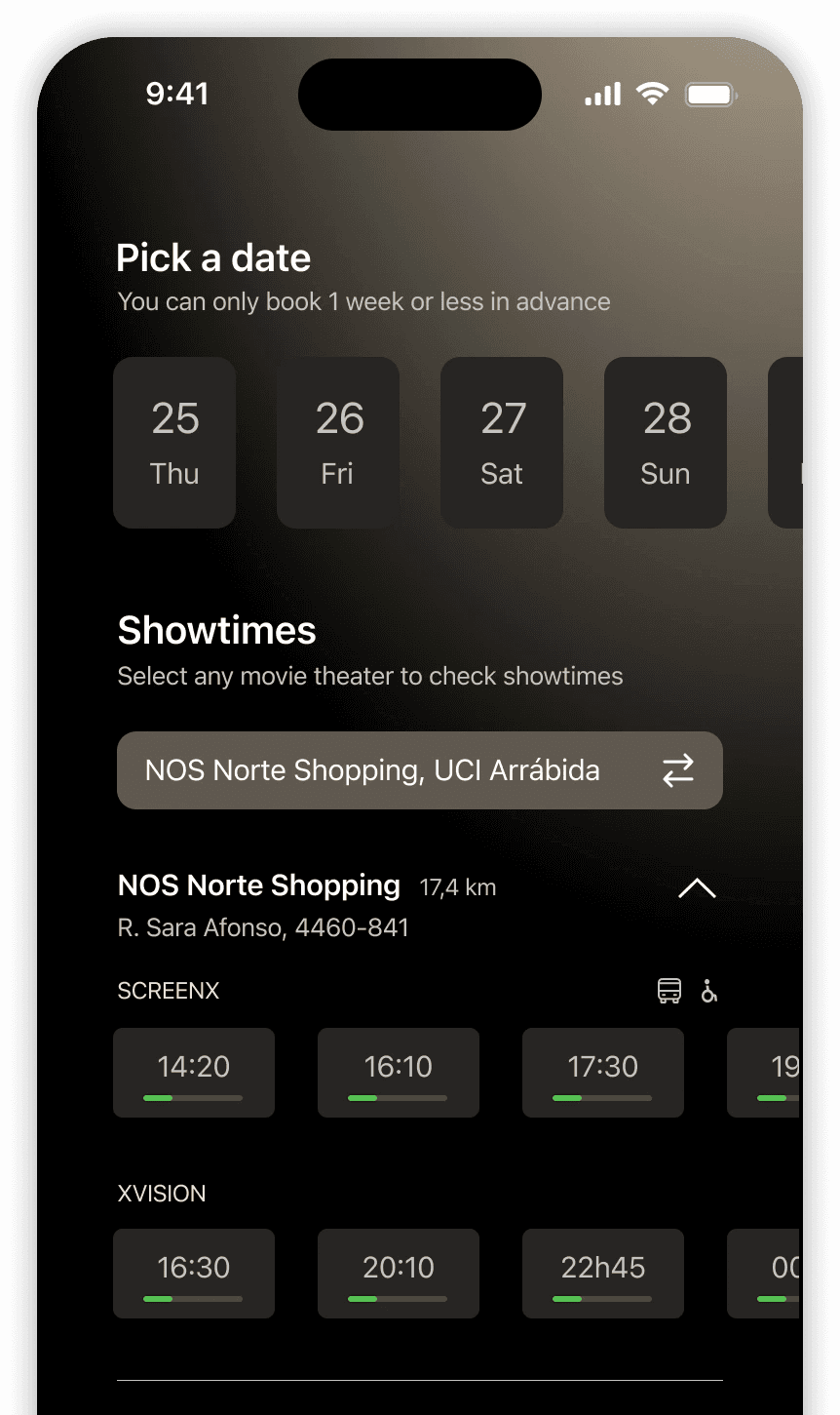
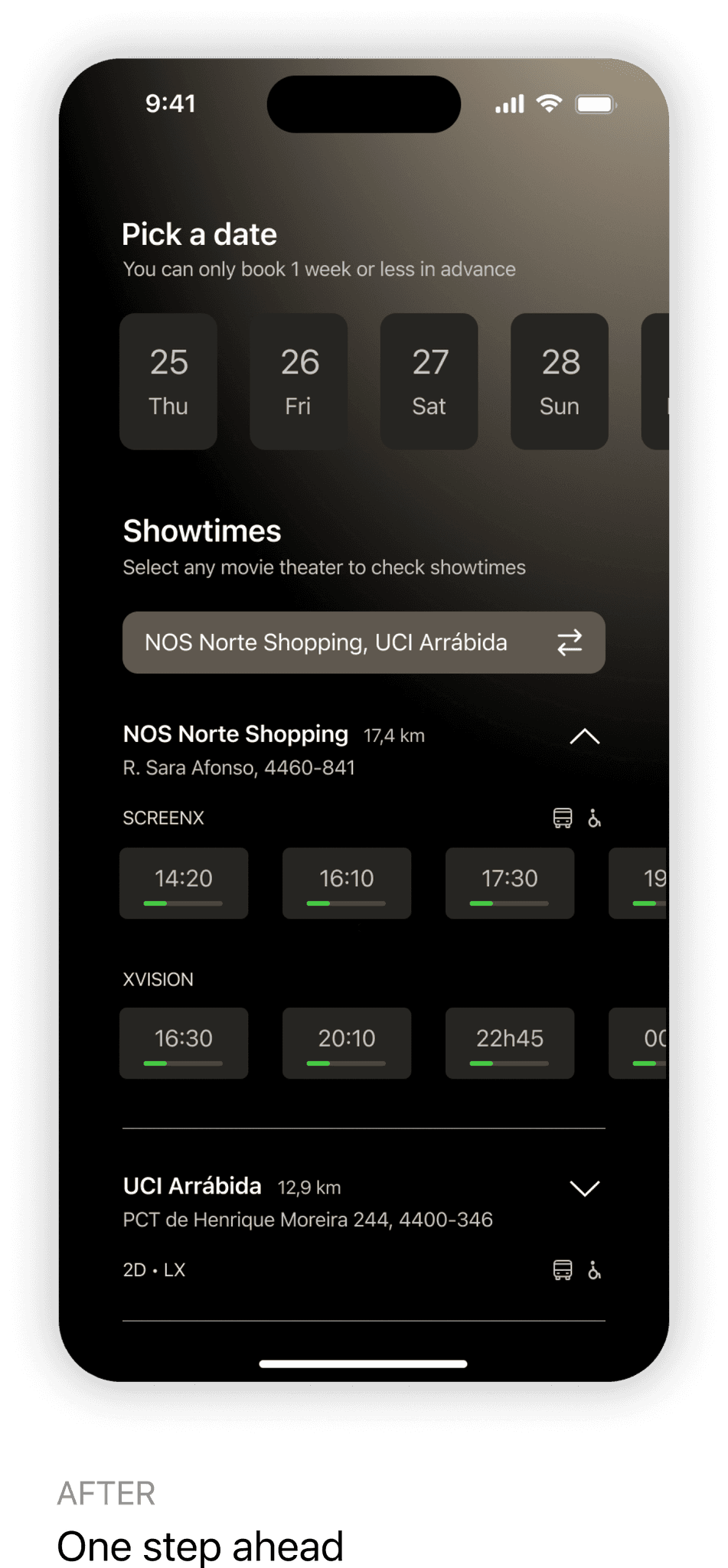
Based on feedback, I revised the design so that only the showtimes for the selected cinema are displayed. This selection can also be made directly from the home screen if desired. The information is now organized more efficiently, with only key info appearing on the screen.

Visible showtime capacity

Based on user feedback, showtime capacity is now displayed before starting the purchase process.

This allows users to make more informed decisions and avoids the hassle of switching back and forth between showtime and seat selection, as an almost full room means fewer desirable seats.

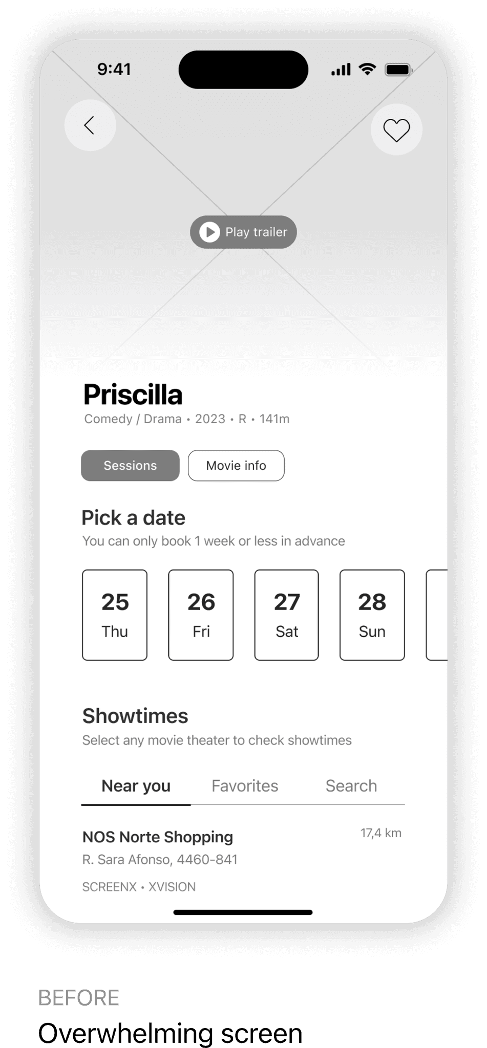
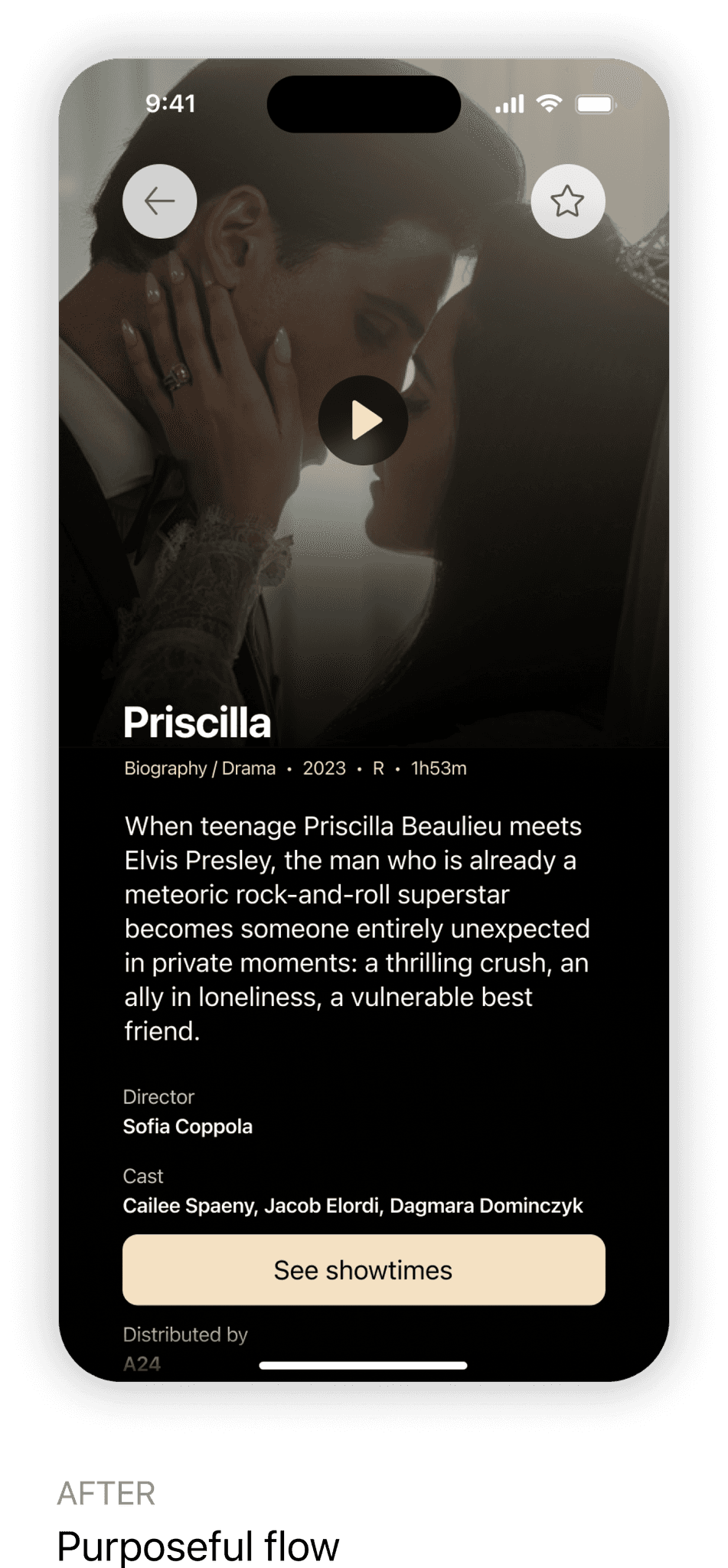
Picking out a movie

At the start of the movie ticket booking process, there are different approaches based on the user's needs — whether they want movie information first or are ready to make a quick purchase.

Initially, I tried to combine both paths into a single screen to avoid back-and-forth navigation. The trade-off for one less tap proved not worth the extra screen scanning required.

Having to compromise, decisive users can easily scan the information screen and quickly book their seats. Meanwhile, others can expect the purposeful flow of the app to help them buy their ticket without feeling overwhelmed.

FINAL PRODUCT

A hassle-free booking experience

Easily manage your tickets

Easily manage your tickets

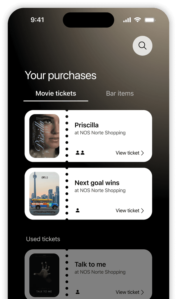
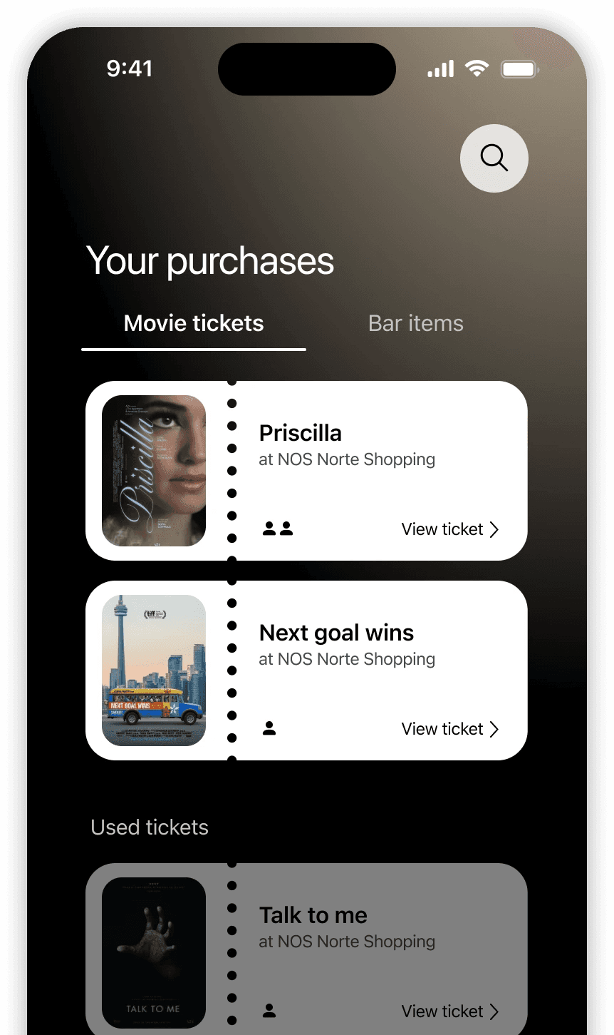
Access your wallet and review your purchases, adjusting your tickets to your needs.

Access your wallet and review your purchases, adjusting your tickets to your needs.

Easily manage your tickets

Access your wallet and review your purchases, adjusting your tickets to your needs.

The choice is yours

The choice is yours

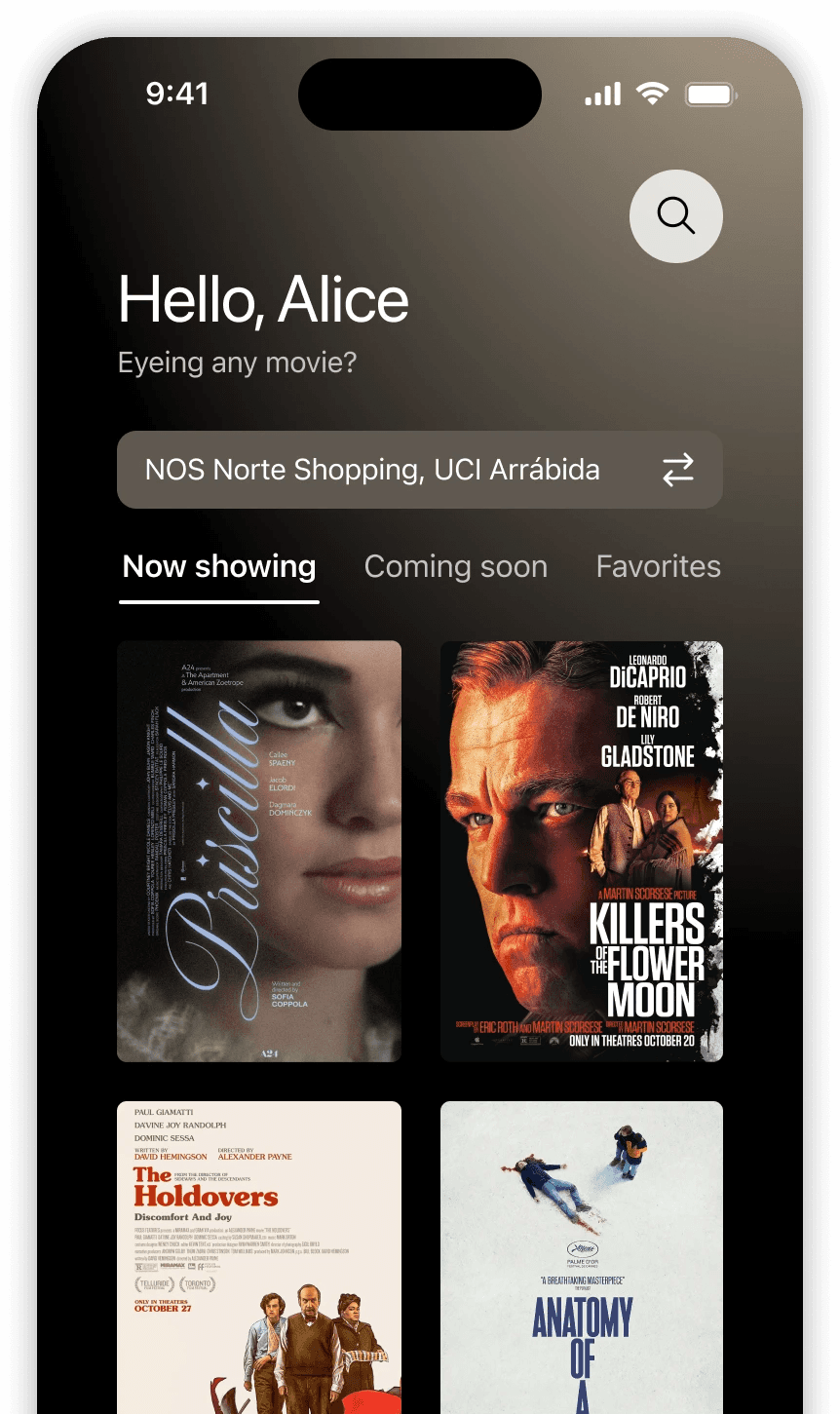
Whether you have a movie in mind or a favorite theater, filter the catalog and showtimes according to your preferences.

Whether you have a movie in mind or a favorite theater, filter the catalog and showtimes according to your preferences.

The choice is yours

Whether you have a movie in mind or a favorite theater, filter the catalog and showtimes according to your preferences.

Sync your plans

Sync your plans

Can't live without a schedule? Add any movie trip to your calendar and stay organized.

Can't live without a schedule? Add any movie trip to your calendar and stay organized.

Sync your plans

Can't live without a schedule? Add any movie trip to your calendar and stay organized.

For the full experience, check out the prototype in the link below.

Movie theater selection

Originally, I designed the selection of a movie theatre with the intent of making the process of choosing a showtime easier, with less taps and quicker. However, this design choice not only ended up cluttering the screen but also overwhelming users with a long scrollable list of available cinemas..

Based on the feedback, only the selected cinema showtimes will appear. This selection is also transversal and can be picked right away on the home screen, if desired. The information is now organized more efficiently with only the key info appearing on screen.

Visible showtime capacity

Based on user feedback, showtimes capacity is now shown before beginning the purchase process. 

This allows for a more informed decision and avoids going back and forth between showtime → seat selection. Because an almost full room means less available and desirable seats.

Picking out a movie

At the start of the movie ticket booking process, there are different approaches based on the user's needs—whether they want movie information first or are ready to make a quick purchase.

Initially, I tried to combine both paths into a single screen to avoid back-and-forth navigation. However, the cluttered screen and the need for extra scanning made this approach impractical.

As a result, decisive users can quickly book their seats by scanning the information screen. In contrast, others can use the app's purposeful flow to buy tickets without feeling overwhelmed.

Alice

“I live a busy life so flexibility and efficiency are my allies”

Alice

“I live a busy life so flexibility and efficiency are my allies”

REFLECTION

Key learnings and first times

Grounding the project is challenging.

This was my first UX/UI project. Starting from understanding the problem, identifying the steps to find a solution, and learning the whole process took longer than expected. I struggled with grasping the project's purpose and requirements. Although I knew the project aimed to help students understand and apply the process, it felt ungrounded. I was building an app from scratch without considering existing similar apps. With these constraints in mind, I followed the course instructions to create an app from ground zero but within the context of addressing issues with existing apps.

Case studies are not an afterthought.

The beauty of first experiences lies in the lessons learned along the way. While the overall process may be similar across projects, each person has their unique approach. When it was time to write my case study, I found myself sifting through multiple sticky notes, affinity maps, user journey maps, and various pieces of information gathered during my research. Although I could connect the dots while working on the project, some information naturally became blurry over time. I realized that crafting a compelling story for a case study requires a coherent narrative, and I struggled to piece it together from my research. As a result, I've learned that as a designer, I find it helpful to craft a story from the beginning and refine it as the project progresses by filtering out unnecessary details, emphasizing key points, and adding new insights.

Finding the balance between visuals and functionality.

With a background in communication design, I have always prioritized the visual appeal of the final product. While I found the research process extremely interesting, I was stuck in my ways when creating mockups. I realized the need to transition from purely visual designs to prioritizing functionality and accessibility. I came to understand that my design choices must consider not only aesthetics but also how users will perceive and interact with the end product. What does it matter if that particular shade of grey looks better if it does not meet the accessibility standards? It is truly essential to find the right balance between aesthetics and functionality, never prioritizing the former over the latter.

You've reached the end.
Still curious? Say hi ↗︎

© Francisca Correia 2024 

Designed with great care and a sprinkle of insomnia.

You've reached the end.
Still curious? Say hi ↗︎

© Francisca Correia 2024 

Designed with great care and a sprinkle of insomnia.

You've reached the end.
Still curious? Say hi ↗︎

© Francisca Correia 2024 

Designed with great care and a sprinkle of insomnia.